Scroll area
A native scroll container with thin overlay scrollbars and edge fades that appear only when content overflows.
pnpm dlx shadcn@latest add @uiarc/scroll-areaActivity

Emma Collins approved the onboarding redesign
2m
Marcus Johnson merged fix for the flaky checkout test
9m
Chloe Nguyen shared the September retention report
21m
Daniel Kim rotated the staging API keys
38m
Sofia Ramirez moved the vendor review to Thursday
1h
Jasmine Brooks left 4 comments on Pricing page v3
1h
Olivia Bennett scaled the worker pool to 12 nodes
2h
Ryan Sullivan closed the Northwind renewal
3h
Hannah Walsh resolved 18 support tickets
4h
Mateo Alvarez published iOS build 4.12 to TestFlight
5h
Nathan Cole scheduled the Q4 planning offsite
6h
Ava Mitchell launched the fall email campaign
Yesterday
Rooms
 Living roomOak beams, linen sofas
 SunroomRound table for six
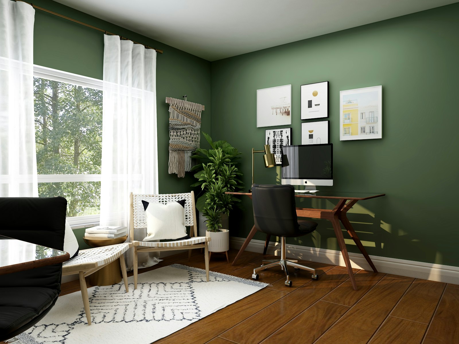 StudyGreen walls, walnut desk
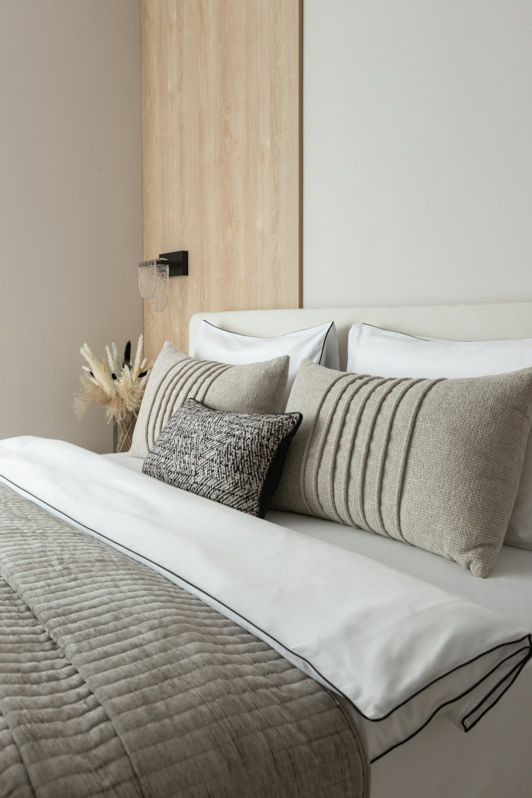 BedroomStriped linen, oak bed
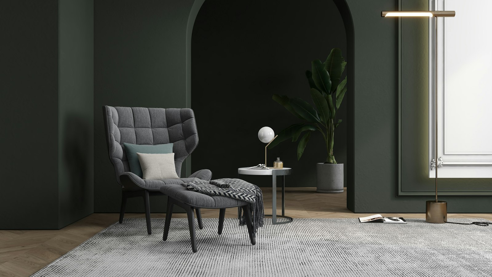 Reading nookArmchair and ottoman
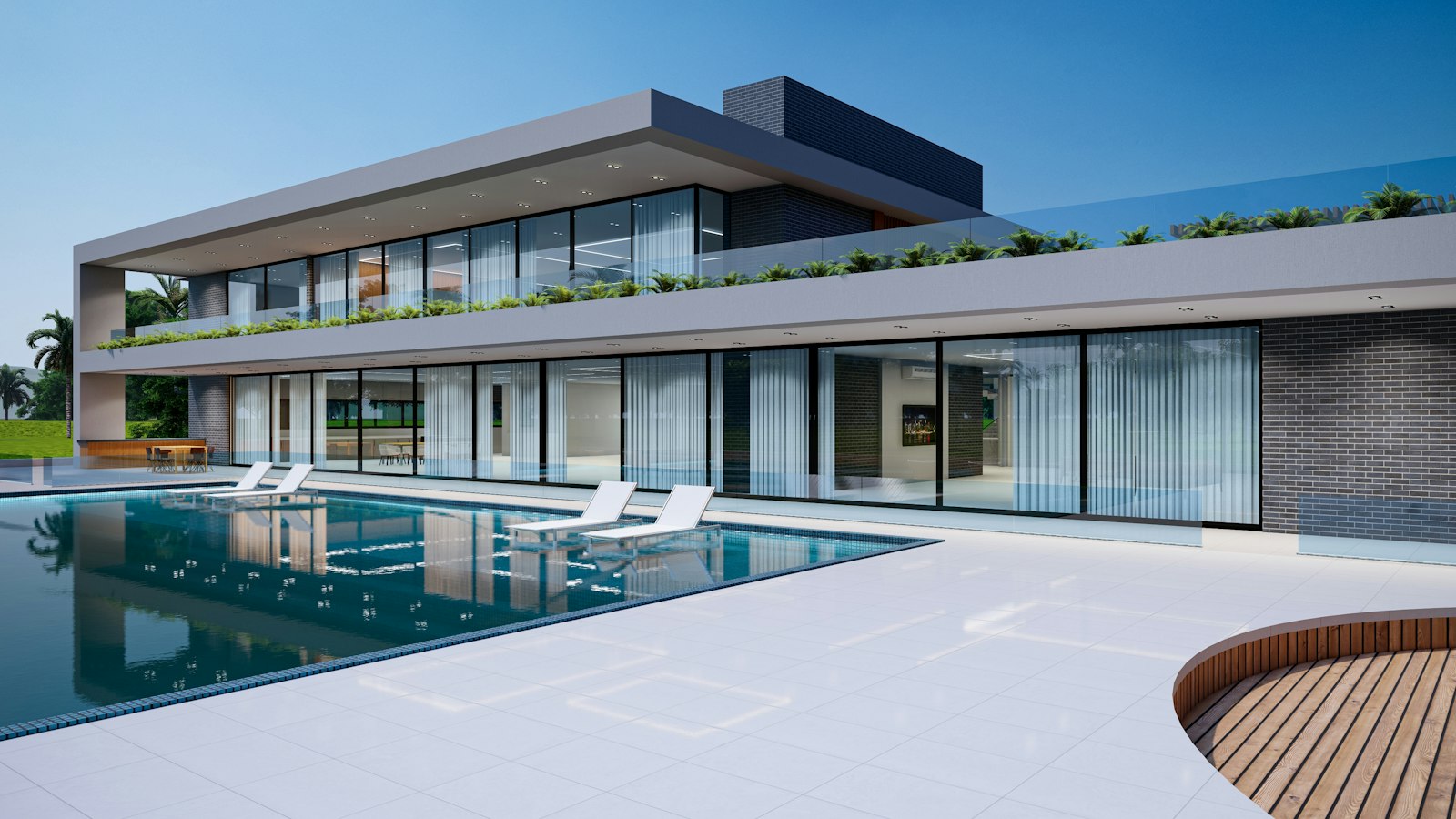 Pool houseGlass walls, long pool
- Panels, sidebars, and popovers whose content can outgrow their box.
- Horizontal strips of cards or chips that need mouse-wheel scrolling and snap points.
- Places where platform scrollbars look heavy but native scrolling must be kept.
- Use carousel when items should page one at a time with controls.
- Do not wrap the whole page; let the document scroll natively.
- Use data-grid for large tabular data; it virtualizes its own scroll.
Installation
Add Scroll area with the shadcn CLI, or copy the source by hand.
pnpm dlx shadcn@latest add @uiarc/scroll-areaAdds the component and its local dependencies. First time? Add the @uiarc registry to components.json, or use the full URL:
import { ScrollArea } from "@/registry/components/scroll-area/scroll-area"; export function ActivityPanel({ events }: { events: { id: string; text: string }[] }) { return ( <ScrollArea maxHeight={320} label="Recent activity"> <ul>{events.map(event => <li key={event.id}>{event.text}</li>)}</ul> </ScrollArea> );}Horizontal strip with snap
<ScrollArea orientation="horizontal" snap="x mandatory" label="Templates"> <div style={{ display: "flex", gap: 12 }}> {templates.map(item => <TemplateCard key={item.id} {...item} style={{ scrollSnapAlign: "start" }} />)} </div></ScrollArea>ScrollArea
A native scroll container with thin overlay scrollbars that appear while scrolling or on hover, and edge fades that grow with the content left beyond each edge.
orientation"vertical" | "horizontal" | "both""vertical"Axes that scroll.fadenumber28Length of the edge fade in px. 0 turns the fades off.scrollbars"auto" | "always""auto""auto" shows scrollbars while scrolling or hovering; "always" keeps them visible when content overflows.hideDelaynumber900How long scrollbars linger after scrolling stops, in ms.maxHeightCSSProperties["maxHeight"]–Maximum viewport height, for vertical areas that grow with their content.snapCSSProperties["scrollSnapType"]–Passed to the viewport's scroll-snap-type, for example "x mandatory". Children set their own scroll-snap-align.labelstring–Accessible name. The viewport becomes a labelled region.wheelToHorizontalbooleantrueTurns vertical wheel movement into horizontal scrolling for horizontal areas.viewportClassNamestring–Extra class on the scrolling viewport.viewportStyleCSSProperties–Inline style on the viewport.viewportRefRef<HTMLDivElement>–The scrolling element, for programmatic scrolling.onScroll(event: UIEvent<HTMLDivElement>) => void–Viewport scroll handler.onEdgeChange(edges: ScrollAreaEdges) => void–Called when content starts or stops extending past an edge: { top, bottom, left, right }....propsHTMLAttributes<HTMLDivElement>–Forwarded to the root, including ref and className.- Tab
- The viewport is focusable (tabIndex 0).
- Arrow keysorPage UporPage DownorHomeorEndorSpace
- Scroll natively once the viewport has focus.
- Scrolling stays native, so keyboard, screen reader, and touch behavior match the platform.
- With label, the viewport is a named region; without one, give it context another way.
- The overlay tracks and thumbs are aria-hidden; the hidden native scrollbar remains the real control.
- Scrollbars fade in while scrolling or on hover and fade out after hideDelay; the thumb thickens under the pointer.
- Pressing the track pages 90% of the viewport toward the pointer with smooth scrolling, or instantly under reduced motion.
- Reduced motion removes scrollbar transitions.
- Touch keeps native momentum scrolling; the overlay bars only appear while scrolling.
- Thumbs only thicken on hover-capable fine pointers.
- Content changes and resizes are tracked with ResizeObserver and MutationObserver, so fades and thumbs stay correct as layouts reflow.
- Fades and thumb positions are written straight to the DOM on each scroll event; scrolling never re-renders React.
- Horizontal wheel conversion only captures the wheel while there is room to scroll, so the page still scrolls at the ends.
- Edge fades use CSS mask-image, which is cheap but still composited; set fade={0} in very long lists if you see cost.
Notes for AI
Give your coding assistant the Markdown reference instead of screenshots.
- Use it wherever content scrolls inside a fixed box: sidebars, panels, menus, horizontal card strips.
- Give vertical areas a height or maxHeight; the viewport scrolls only when it has a constrained size.
- Use onEdgeChange to show a "more below" affordance or to load more when bottom becomes false.
The full library index for assistants is at /llms.txt.