Avatar upload
ProClick or drop a photo onto the avatar to crop it in place with drag, pinch and zoom. It uploads through a progress ring and settles, with clear errors and retry.
Profile
Click or drop a photo on the avatar. Uploads are simulated.
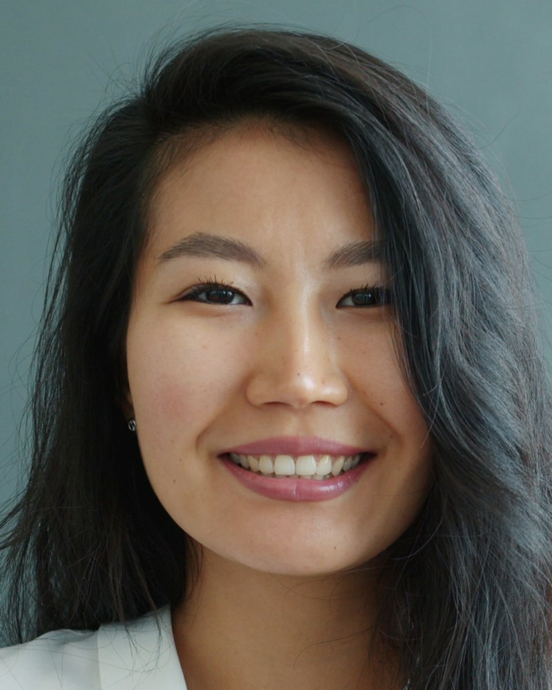
Profile photo
- Profile, account and team member settings where a person sets their own photo.
- Workspace or organization logos that display in a circle.
- Onboarding steps that ask for a photo and should show upload progress in place.
- Several files or documents at once: use file-dropzone.
- Free form crops with aspect ratios, rotation or a large canvas: use image-cropper.
- Showing an avatar without editing: use avatar.
Installation
Pro source and install commands unlock with a Pro plan.
import { AvatarUpload } from "@/components/arc/avatar-upload/avatar-upload"; export function ProfilePhoto({ user }: { user: User }) { return ( <AvatarUpload name={user.name} src={user.avatarUrl} onUpload={async (image, { report, signal }) => { const { uploadUrl, publicUrl } = await api.createAvatarUpload(); await putWithProgress(uploadUrl, image, { onProgress: report, signal }); await api.saveAvatar(publicUrl); return publicUrl; }} onRemove={() => api.removeAvatar()} /> );}AvatarUpload
A profile photo control. Click or drop an image on the avatar and the avatar itself grows into a circular crop stage, with the rest of the photo dimmed around the mask. Drag to reposition, scroll, pinch or use the slider to zoom, then save: the circle shrinks back with the cropped photo inset inside a progress ring, and when the upload resolves the ring closes and lets go as the photo settles to full size. Too large, wrong type and failed uploads are explained in place, with retry. Initials show when there is no photo.
nameRequiredstring–Person's name, used for the initials fallback.srcstring–Current photo URL. Changing it replaces the shown photo.onUploadRequired(image: Blob, context: { report: (progress: number) => void; signal: AbortSignal; original: File }) => Promise<string | void>–Receives the cropped square image. Call report with 0 to 1 as bytes go out to fill the ring; until you do, the ring turns without a value. Resolve with the stored URL, or with nothing to keep showing the local crop. Reject to show the error message and a Try again button. signal aborts when the person cancels.onRemove() => void–Called after Remove. Without it the Remove button is hidden.onError(error: { code: "type" | "size" | "decode" | "upload"; message: string }) => void–Called whenever an error message is shown, for logging or analytics.acceptstring[]["image/png", "image/jpeg", "image/webp"]Accepted MIME types. The default hint lists them.maxSizenumber5242880Largest file in bytes, 5 MB by default. Checked before the image is decoded.sizenumber88Avatar diameter in px while not cropping. The crop circle is 184px.outputSizenumber512Side of the square image passed to onUpload, in px. PNGs stay PNG to keep transparency; everything else becomes JPEG at 92% quality.labelstring"Profile photo"Heading beside the avatar and the group's accessible name.hintReactNode–Helper copy. Defaults to the accepted types and the size limit, such as PNG, JPG or WebP, up to 5 MB.disabledboolean–Blocks picking, dropping and removing.classNamestring–Class on the root element.styleCSSProperties–Inline styles on the root element.refRef<AvatarUploadHandle>–open() shows the file picker; selectFile(file) runs a file through the same checks as a pick or drop and opens the cropper, for your own buttons, paste handlers or camera capture.- Tab
- Moves to the avatar, then Upload photo or Replace photo, then Remove. While cropping: the crop area, zoom out, the zoom slider, zoom in, Save photo, Cancel.
- EnterorSpace
- On the avatar, opens the file picker.
- Arrow keys
- In the crop area, move the photo by 2% of the circle; hold Shift for 10%.
- +or-
- In the crop area, zoom in or out.
- 0
- In the crop area, reset zoom and position.
- Enter
- In the crop area, save and upload.
- Escape
- In the crop area, cancel and return to the current photo.
- The component is a group named by its label. The avatar is a button named Change profile photo or Upload profile photo.
- Opening the cropper moves focus to the crop area, a focusable group whose name gives the zoom and every key. Saving, canceling and removing return focus to the upload button.
- The zoom slider is a native range with aria-valuetext in percent, flanked by Zoom out and Zoom in buttons.
- Errors, the uploading state, Photo updated and Photo removed appear in a polite live region; progress is announced in 25% steps. Errors pair an icon with a sentence that says what to do next.
- The photo, the dimmed overflow and the rings are decorative; the state they show is always in text as well.
- Pointer focus draws no ring; keyboard focus shows Arc's shared focus ring. Keyboard focus on the avatar shows the same camera overlay as hover.
- Opening the cropper grows the avatar itself into the 184px crop circle with a layout animation on the smooth spring, while a tinted stage fades in behind it and the new photo fades in. The layout reflows once and the circle travels to its new place; the block's height follows on the same spring.
- Dragging tracks the pointer one to one. Past an edge the photo follows at a falling rate and never more than a quarter of the circle, then springs back inside the bounds on release. The dimmed overflow brightens while you drag, zoom or scrub the slider.
- Wheel, trackpad pinch and two finger pinch zoom toward the pointer or between the fingers, so the point you aim at stays still. The slider zooms around the centre.
- Saving shrinks the circle back, insets the cropped photo to 90% under a dim scrim and draws a 2px ring outside it. The ring turns while waiting, then fills with reported progress on the smooth spring.
- On success the ring closes, then a second full ring widens by 12% and fades over 480ms while the photo springs back to full size on the snappy spring and the scrim lifts.
- A failed upload stops the ring where it was and turns it to the danger color, keeping the pending photo inset until you retry or discard.
- With reduced motion the circle resizes at once, the photo snaps to its bounds, the settle ring is skipped and the waiting ring turns slowly.
- At rest the avatar sits beside its label, message and buttons at every width down to 320px; below 400px the spacing tightens so Replace photo and Remove stay on one row.
- While cropping, the 248px stage sits beside the controls on wide containers and stacks above them below 480px, measured with a container query so it adapts to narrow cards as well as phones.
- The crop stage uses touch-action: none so dragging and pinching never scroll the page; the wheel is captured only over the stage.
- The cropper moves two copies of the photo with a single transform each, in percentages of their own size, so the photo stays correct while the circle resizes and no layout runs per frame.
- The crop is drawn once into a canvas at outputSize when you save; the original file is never re-encoded before that.
- Size and type are checked before decoding, so a 12 MB file is rejected without being read into an image.
Notes for AI
Give your coding assistant the Markdown reference instead of screenshots.
- Wire onUpload to your storage and call report from your upload progress events; the ring is only as honest as the progress you report.
- Resolve with the stored URL so the avatar shows the canonical file; object URLs made by the component are revoked when replaced and on unmount.
- Reject with an Error whose message says what happened and what is unchanged; it is shown as is.
- Keep accept and maxSize in line with your backend. The default hint is generated from them.
- Use the ref's selectFile to accept pasted images or photos from your own camera capture; they pass the same checks as a drop.
- Real portraits in the gallery demo come from public/media/people/portrait; the demo uploads nothing.
The full library index for assistants is at /llms.txt.