Carousel
Browse a row of slides by dragging, flicking, or arrowing through them.
pnpm dlx shadcn@latest add @uiarc/carouselLive · keyboard ready
From the Harbour suites

Oak lounge chair
Woven seat on a solid oak frame
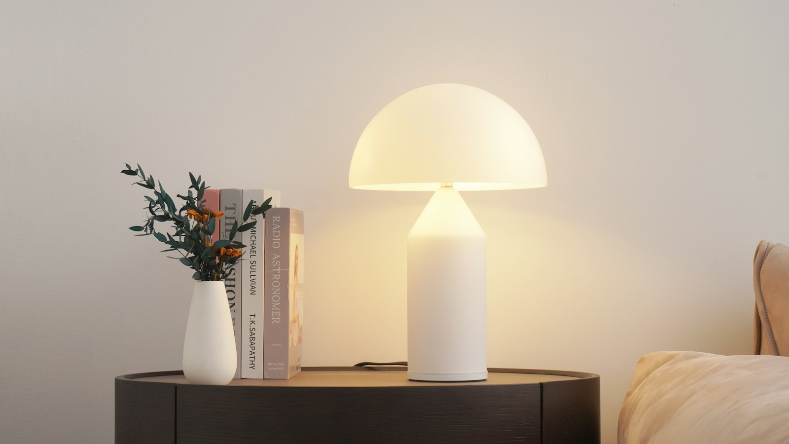
Opal table lamp
Hand-blown glass shade, dimmable

Stonewashed linen throw
Oat, 130 × 180 cm
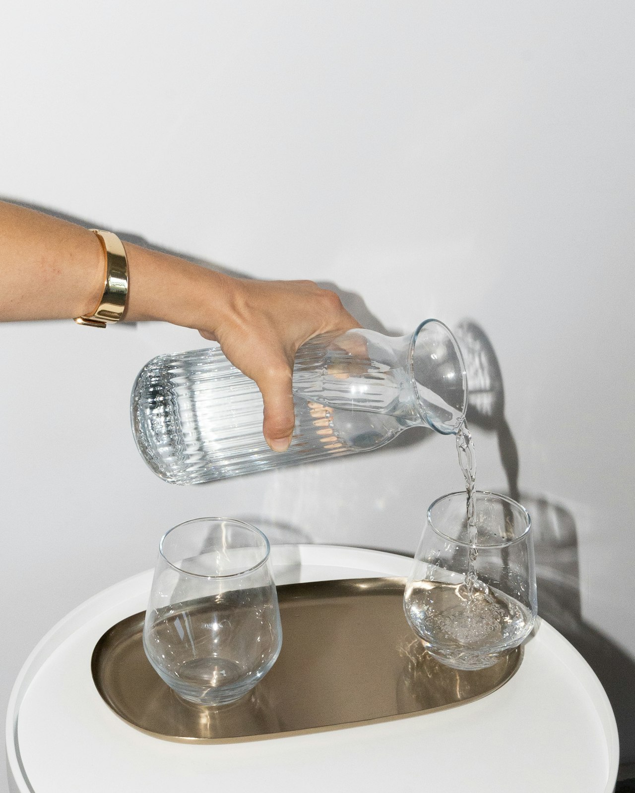
Ribbed glass carafe
Mouth-blown, holds 1 liter

Sea at dusk
Giclée print on cotton rag, 50 × 50 cm
- A short set of peer items where neighbouring slides hint at more.
- Galleries browsed by drag, flick, trackpad swipe, or keys.
- Rotating highlights with a visible pause control, via interval.
- Use cover-flow for a showpiece gallery and photo-grid to show everything at once.
- Use card-stack for deciding on items one at a time.
Installation
Add Carousel with the shadcn CLI, or copy the source by hand.
pnpm dlx shadcn@latest add @uiarc/carouselAdds the component and its local dependencies, and installs motion, lucide-react. First time? Add the @uiarc registry to components.json, or use the full URL:
example.tsx
import { Carousel } from "@/registry/components/carousel/carousel"; export function Suites() { return ( <Carousel label="Harbour suites" interval={5000}> <img src="/suite-1.jpg" alt="Sea view suite" /> <img src="/suite-2.jpg" alt="Garden suite" /> <img src="/suite-3.jpg" alt="Loft suite" /> </Carousel> );}Carousel
A centered slide row browsed by drag, flick, trackpad swipe, arrow keys, or pill indicators, with optional rotation.
PropTypeDefaultDescription
labelRequiredstring–Names the carousel for assistive technology.childrenRequiredReactNode–One child per slide.indexnumber–Controlled active slide. Pair with onIndexChange.defaultIndexnumber0Initial slide when uncontrolled.onIndexChange(index: number) => void–Called when the active slide changes.slideSizestring"min(80cqw, 340px)"Width of one slide as a CSS length.slideLabel(index: number, count: number) => string"2 of 5"Names each slide and its indicator.intervalnumber–Milliseconds per slide. Adds a play control for rotation.autoplaybooleanfalseStarts rotating on mount.classNamestring–Class for the root section.- ArrowLeftorArrowRight
- Moves to the previous or next slide.
- HomeorEnd
- Jumps to the first or last slide.
- Tab
- Moves between the slide area, play control, active indicator, and arrows.
- The root is a section with aria-roledescription="carousel"; slides are labelled tabpanels and the indicators a role="tablist".
- Inactive slides are inert, so their links are not focusable.
- Slide changes are announced in a polite live region.
- Rotation pauses on hover, keyboard focus, and drag, and has a visible pause control.
- Slides follow the finger and settle with momentum; neighbors shrink and dim with distance.
- The indicator stretches into a pill that tracks the slides, and drains to show rotation time.
- Reduced motion jumps between slides and disables rotation.
- Slides default to min(80cqw, 340px), so they size to the carousel's container rather than the viewport.
- Controls tighten when the container is under 340px.
- All slides stay mounted; inactive ones are inert, so keep the set short.
- Rotation pauses offscreen via IntersectionObserver and in hidden tabs via visibilitychange.
Notes for AI
Give your coding assistant the Markdown reference instead of screenshots.
- Use for a short set of peer items where neighbors should hint at more. Use cover-flow for a showpiece gallery and photo-grid to show everything at once.
- Give each slide a stable key if the list can change, and write a specific label.
- Keep autoplay off unless rotation is essential.
The full library index for assistants is at /llms.txt.