Glass menuPro
A glass action menu whose trigger morphs into the panel, with a highlight pill that glides between rows, one in-place submenu, and full keyboard support.
Live · keyboard ready
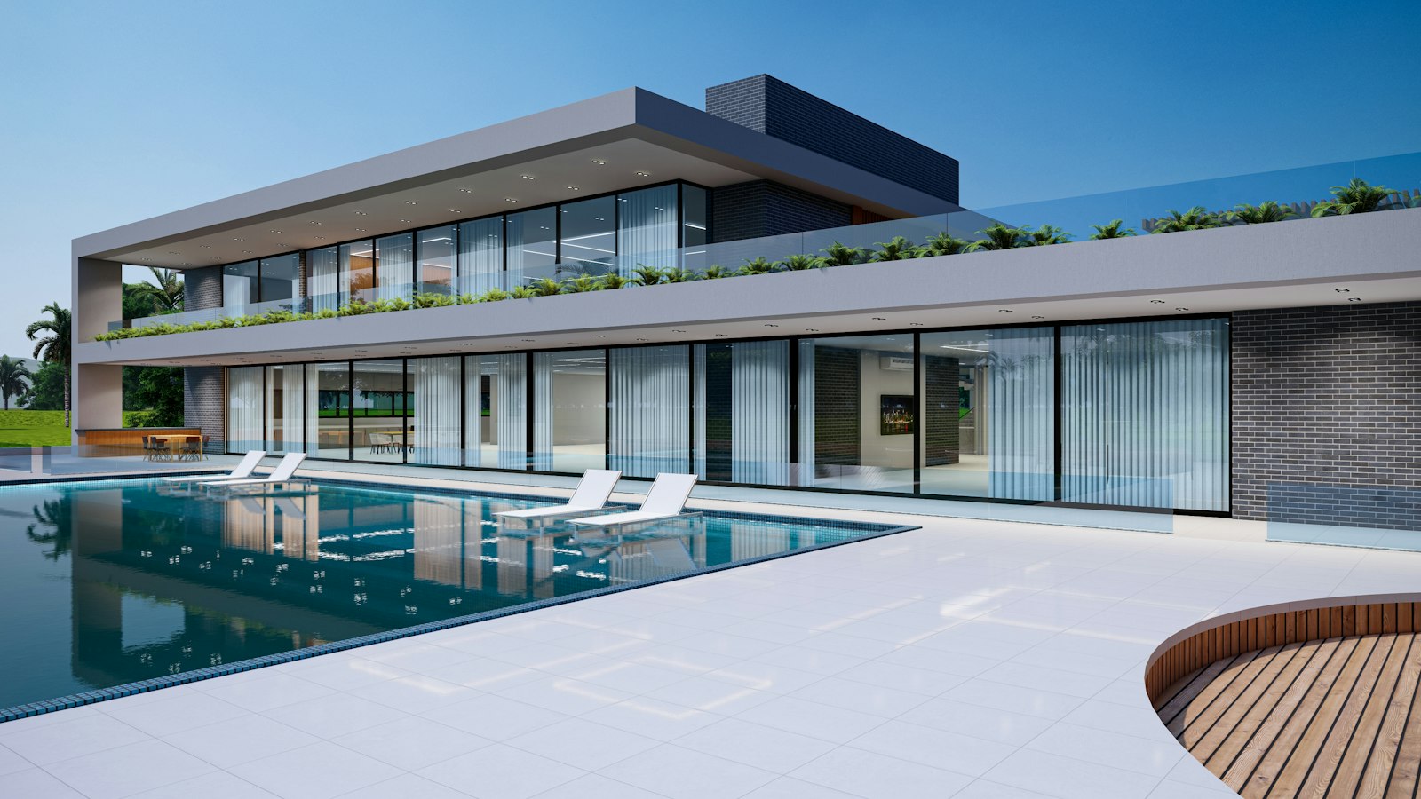
- Actions for a photo, file, or card shown over an image or a colorful canvas.
- A title menu in an editor or viewer, where the title itself opens the actions.
- Plain settings pages with no imagery behind the menu. Use dropdown-menu on a neutral surface.
- Navigation between pages. Use morph-nav or tabs.
- Deep hierarchies. Use a command palette or a dedicated screen.
Installation
Pro source and install commands unlock with a Pro plan.
example.tsx
import { Copy, FolderInput, Trash2 } from "lucide-react";import { GlassMenu } from "@/components/arc/glass-menu/glass-menu"; export function PhotoActions() { return ( <GlassMenu label="Photo actions" onSelect={id => console.log(id)} groups={[ { id: "edit", items: [ { id: "duplicate", label: "Duplicate", icon: <Copy size={16} />, shortcut: "⌘D" }, { id: "move", label: "Move to", icon: <FolderInput size={16} />, items: [ { id: "lisbon", label: "Lisbon trip" }, { id: "archive", label: "Archive" }, ] }, ] }, { id: "danger", items: [{ id: "delete", label: "Delete", icon: <Trash2 size={16} />, danger: true }] }, ]} > Pool house </GlassMenu> );}API reference
2 parts. The first is the root.
GlassMenu
A glass action menu. The trigger morphs into the panel on a spring, a glass pill slides between rows, one submenu slides in place, and the panel morphs back into the trigger on close.
PropTypeDefaultDescription
groupsRequiredGlassMenuGroup[]–Rows in groups: `{ id, label?, items }`. Groups are separated by a hairline; `label` adds a quiet heading.childrenRequiredReactNode–Trigger content, usually a short label and a chevron or an icon.labelstring"Actions"Accessible name of the menu.triggerLabelstring–Accessible name of the trigger when it only shows an icon.openboolean–Controlled open state.defaultOpenbooleanfalseInitial open state when uncontrolled.onOpenChange(open: boolean) => void–Called when the menu opens or closes.onSelect(id: string, item: GlassMenuItem) => void–Called with the chosen row. Rows with `items` open their submenu instead.align"start" | "end""start"Which edge of the trigger the panel grows from.widthnumber256Panel width in px, capped to the viewport.classNamestring–Extra class on the root.styleCSSProperties–Inline styles on the root.GlassMenuItem
One row.
PropTypeDefaultDescription
idRequiredstring–Stable id passed to `onSelect`.labelRequiredstring–Row text. Also used for typeahead.iconReactNode–A 16px icon. It takes the accent color while the row is highlighted.shortcutstring–Shortcut hint on the right, such as "⌘D". Display only.checkedboolean–Makes the row a checkbox item with an accent check. Leave undefined for plain actions.dangerboolean–Uses the danger color for destructive actions.disabledboolean–Skipped by the keyboard and ignores clicks.itemsGlassMenuItem[]–Nested rows. The submenu slides in place with a back row, one level deep.keepOpenboolean–Keeps the menu open after the row is chosen. Handy for checkable rows.- EnterorSpaceorArrowDown
- On the trigger, open the menu with the first row highlighted.
- ArrowUp
- On the trigger, open the menu with the last row highlighted.
- ArrowDownorArrowUp
- Move the highlight, skipping disabled rows and wrapping at the ends.
- HomeorEnd
- Jump to the first or last row.
- EnterorSpace
- Choose the highlighted row, or open its submenu.
- ArrowRight
- Open the submenu of the highlighted row.
- ArrowLeft
- In a submenu, go back to the parent row.
- Escape
- Leave the submenu, or close the menu and return focus to the trigger.
- Tab
- Close the menu and return focus to the trigger.
- Letters
- Typeahead: jump to the next row whose label starts with what you type.
- The trigger has `aria-haspopup="menu"`, `aria-expanded`, and `aria-controls` pointing at the open menu.
- Rows are `menuitem`, or `menuitemcheckbox` with `aria-checked` when `checked` is set; rows with a submenu carry `aria-haspopup`.
- Focus moves to the highlighted row, so screen readers announce it; with no row highlighted the menu itself holds focus.
- Pressing outside closes the menu without stealing focus from what was pressed.
- Pointer focus draws no ring; keyboard focus shows Arc's shared focus ring. The highlight pill marks the active row for keyboard and pointer alike.
- The trigger's glass and the panel's glass share a layout id, so opening is one spring morph from the trigger's box to the panel's, and closing morphs back.
- Rows fade and sharpen in a beat after the glass starts to grow, so text never shows outside the glass.
- The highlight pill glides between rows on the shared morph spring.
- The submenu slides in the direction of travel while the panel height follows on a critically damped spring.
- With reduced motion the panel and submenu appear in place and the pill jumps.
- The panel width is capped to the viewport, and the submenu slides in place instead of flying out to the side.
- Touch opens on tap; rows are 36px tall with a full width hit area.
- The open and close morph is a transform on one element; the backdrop blur is the main paint cost, on a single layer.
- The menu mounts only while open.
Notes for AI
Give your coding assistant the Markdown reference instead of screenshots.
- Use for a compact action menu on media, cards, or toolbars that sit over imagery, where the glass reads against the content behind it.
- Put the most common actions first, keep shortcuts accurate, and put destructive rows in their own last group with `danger`.
- Only one submenu level is supported, by design; it slides in place so it works at 320px.
- For checkable rows, pass `checked` from your state and `keepOpen` so people can toggle without reopening.
The full library index for assistants is at /llms.txt.