Glass cardPro
A glass info panel over a photo whose rim catches a pointer-following highlight while the card tilts; tap to morph it into a detail sheet.
Live · keyboard ready
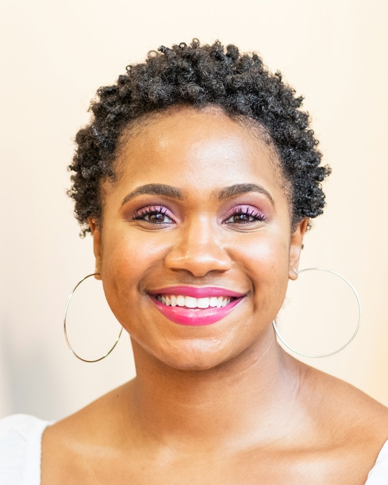
- Profile, host, or creator cards on a landing page or in a discovery grid.
- A featured product or stay where the photo sells and the details can wait for a tap.
- Dense grids of many cards; tilt and glass on every tile gets busy. Use card.
- Cards that should open a full page; use card-to-article.
Installation
Pro source and install commands unlock with a Pro plan.
example.tsx
import { GlassCard } from "@/registry/components/glass-card/glass-card"; export function Host() { return ( <GlassCard image="/people/jasmine.jpg" imageAlt="Portrait of Jasmine Brooks" title="Jasmine Brooks" subtitle="Design lead, Lisbon" aside="4.9"> <p>Leads design systems at Meridian.</p> <button type="button">Follow</button> </GlassCard> );}GlassCard
A photo card with a glass info panel. The panel's rim catches a specular highlight under the pointer, the card tilts a few degrees toward it, and a tap morphs the panel up into a detail sheet.
PropTypeDefaultDescription
imageRequiredstring–Photo behind the glass.imageAltRequiredstring–Alt text for the photo. Pass an empty string when it is decorative.titleRequiredstring–Main line in the glass panel, such as a name or a product.subtitleReactNode–Second line under the title.asideReactNode–Small element at the end of the header, such as a price, a rating, or a status.childrenReactNode–Detail content revealed when the card expands. Buttons inside stay interactive and do not toggle the card.openboolean–Controlled expanded state.defaultOpenbooleanfalseInitial expanded state when uncontrolled.onOpenChange(open: boolean) => void–Called when the card expands or collapses.tiltnumber6Maximum tilt in degrees. 0 turns tilt off.classNamestring–Extra class on the card. Set its width here; the card keeps a 4 by 5 ratio.styleCSSProperties–Inline style on the card.- Tab
- Moves to the header button, then into the detail content when open.
- EnterorSpace
- On the header, expands or collapses the card.
- Escape
- Collapses the card and returns focus to the header.
- The glass header is a real button with aria-expanded and aria-controls pointing at the detail region.
- Clicking anywhere on the photo is a pointer shortcut for the same toggle; keyboard users use the header.
- Detail content is removed from the DOM when collapsed, so hidden buttons are never focusable.
- Under prefers-reduced-transparency the glass turns solid.
- Tilt and highlight follow the pointer through springs, so the card eases into position and settles back when the pointer leaves. Touch input skips the tilt.
- Expanding is one shared-layout spring on the panel; the header keeps its position and the details fade up with a short blur.
- The photo scales up slightly and the floor shade deepens while open.
- Reduced motion removes tilt and the morph; the panel switches size and the details fade.
- Fills its container width and keeps a 4 by 5 ratio, so it works from 280px up.
- Touch devices get the tap to expand and skip the pointer tilt.
- Pointer tracking writes springs and CSS variables only, with no React renders per frame.
- One backdrop filter on the panel. The highlight is a masked gradient, not a filter.
Notes for AI
Give your coding assistant the Markdown reference instead of screenshots.
- Use it for one featured entity over a strong photo: a person, a stay, a product. Put the essentials in title, subtitle, and aside, and the rest in children.
- Keep detail content short: a line of text, three stats, and one or two actions. Longer content belongs on a page.
- Give the card a width through className; it sets its own height from the 4 by 5 ratio.
- The accent belongs in the detail actions or a rating icon, not on the glass itself.
The full library index for assistants is at /llms.txt.