Product listingPro
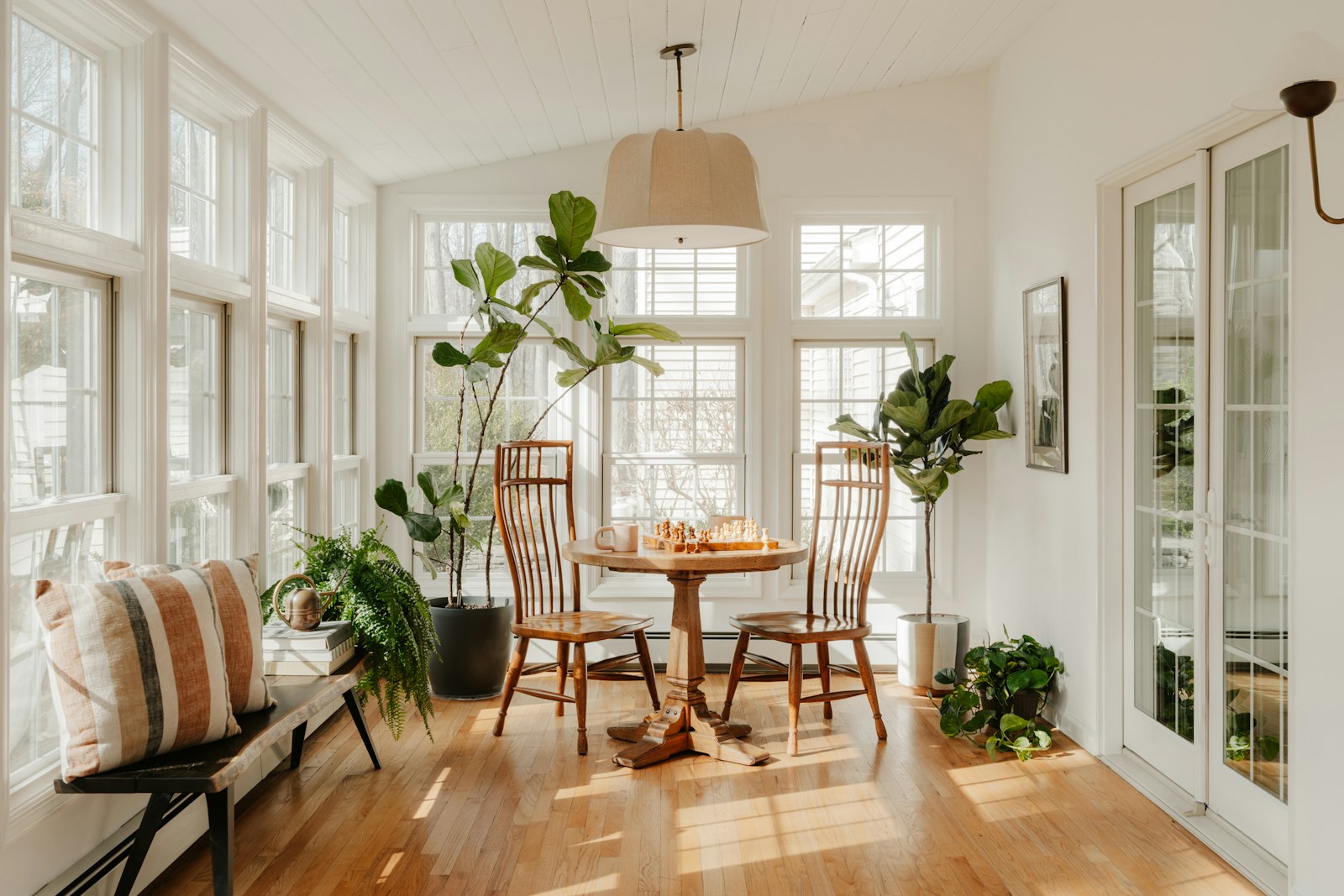
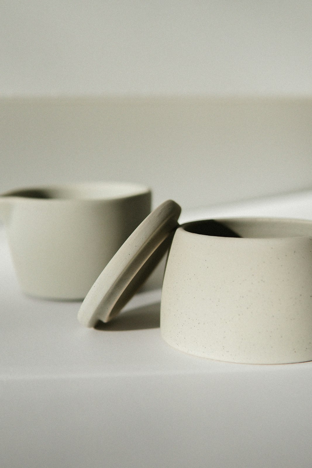
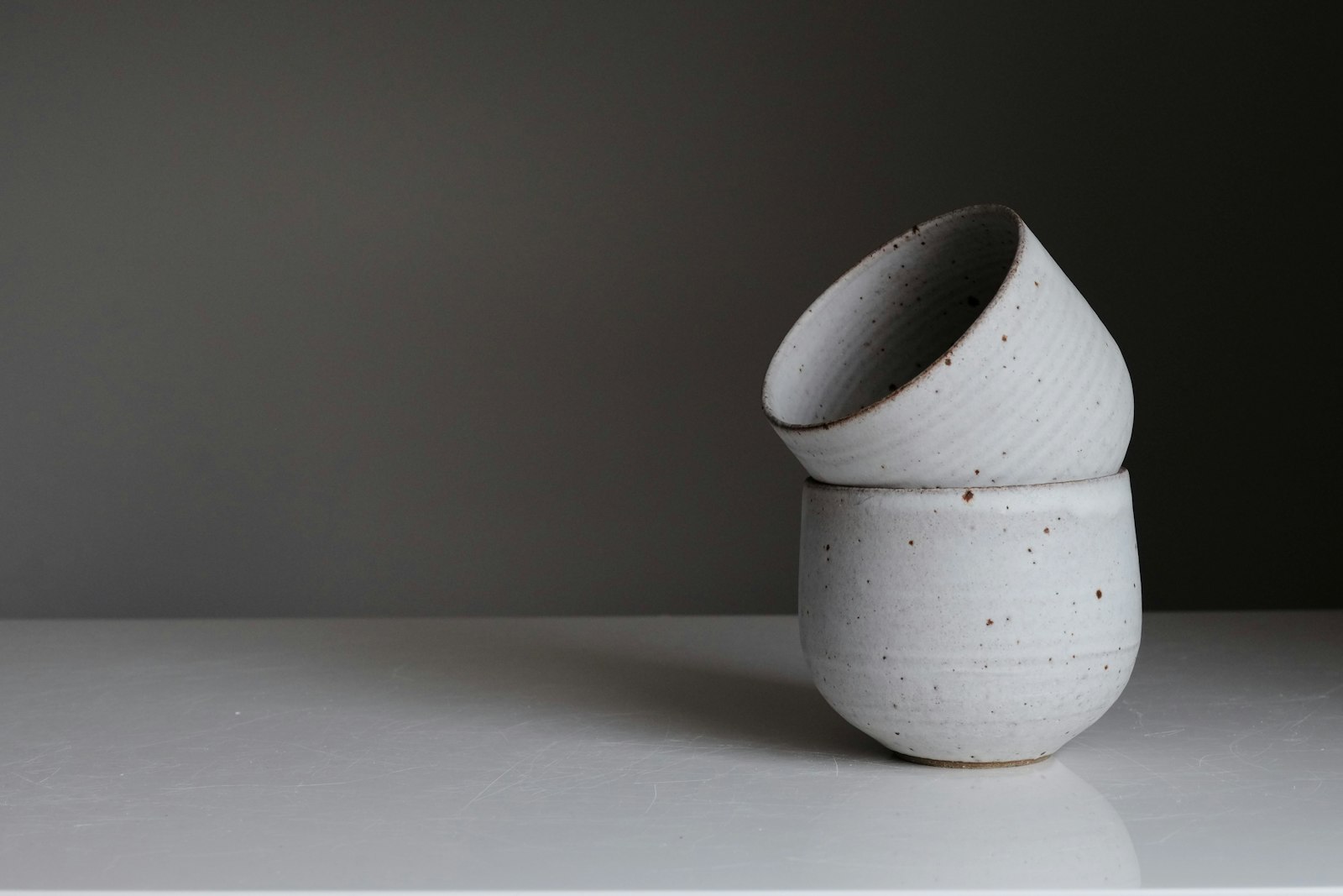
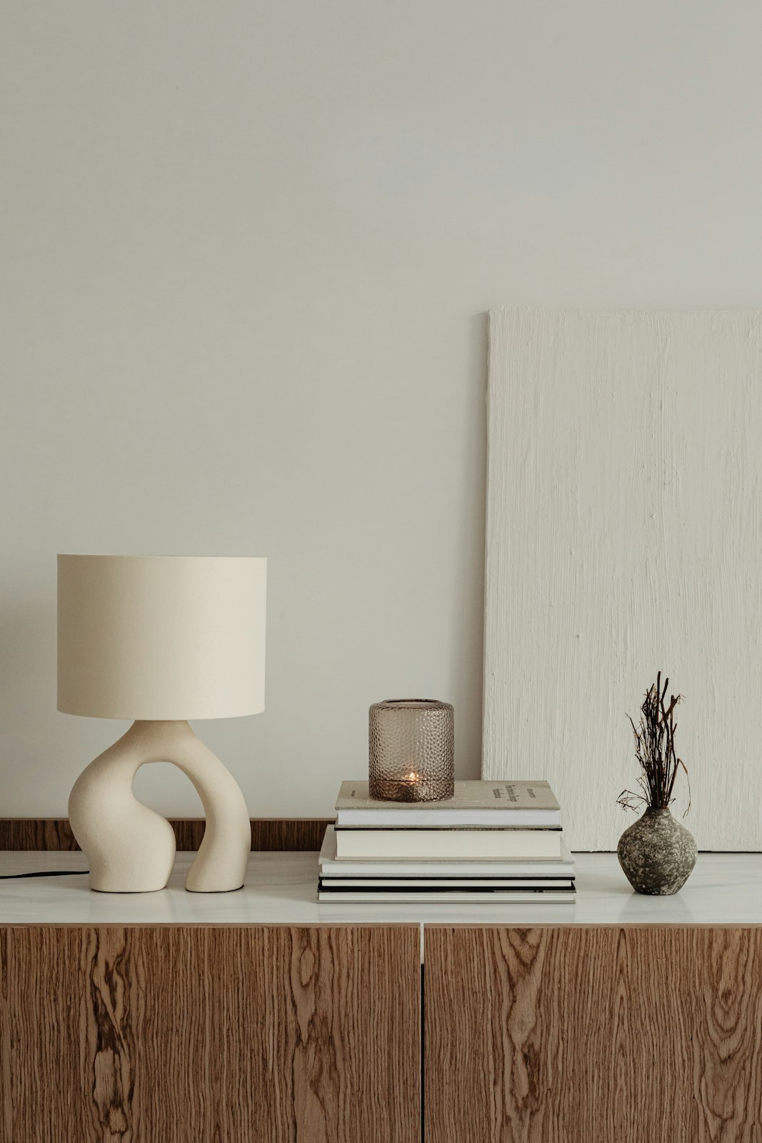
A storefront grid with price, color and size filters, a sort menu, hover photo swaps, and quick add with a size row.
Live block · sample data
- A shop's collection or category page with a few dozen to a few hundred products.
- Catalogs where color and size are the main filters and a quick add saves a trip to the product page.
- One product with many options; use product-detail or product-configurator.
- Huge catalogs with faceted server search; keep the card and filter styles but fetch results from your search service.
Installation
Pro source and install commands unlock with a Pro plan.
Usage
Use this for a category or collection page. Pass products from your catalog, call your cart API in onAddToCart, and move filter state into the URL if you need shareable links.
example.tsx
import { ProductListing } from "@/registry/blocks/product-listing/product-listing"; export function CollectionPage({ products }) { return ( <ProductListing title="Lighting" products={products} onAddToCart={(product, size) => cart.add(product.id, size)} /> );}API reference
2 parts. The first is the root.
ProductListing
A storefront listing with a filter sidebar (dual price range, color swatches, sizes, in stock switch), a sort menu, and product cards that swap to a second photo on hover. Quick add opens a size row inside the card and the bag count rolls.
PropTypeDefaultDescription
productsListingProduct[]sample catalogProducts to list. The price range bounds come from these prices, rounded to 10.colorsListingColor[]sample colors{ id, name, swatch } for the color filter and the dots under each card.sizesstring[]["S", "M", "L"]Size filter options.defaultSort"featured" | "newest" | "price-asc" | "price-desc""featured"Initial sort. Featured uses rank, newest uses added.onAddToCart(product: ListingProduct, size: string) => void–Called when a product is added from its card. Single size products add straight away.defaultCartCountnumber0Items already in the bag.currencystring"USD"ISO currency for prices.localestring"en-US"Locale for price formatting.titlestring"Home goods"Collection heading.classNamestring–Extra class on the root.ListingProduct
PropTypeDefaultDescription
id, name, detailRequiredstring–Identity and a short line under the name, such as the material.priceRequirednumber–Price in whole currency units.compareAtnumber–Previous price. Shows struck through beside the sale price.image, altRequiredstring–Main photo and its description.hoverImagestring–Second photo that crossfades in on hover inside the same 4:5 box, without zooming.colors, sizesRequiredstring[]–Color ids and sizes this product comes in. A product matches a filter when any of its values is selected.inStockRequiredboolean–False shows Sold out in the card meta row and disables quick add.badgestring–Short status text in the card meta row, such as New. Sale is already shown by compareAt.added, rankRequirednumber–Sort keys for newest and featured.- Tab
- Move through filters, the sort menu, and each card's quick add.
- Arrow keys
- Move a price handle by 10, or move through sort options while the menu is open.
- EnterorSpace
- Toggle a swatch or size, choose a sort option, or open quick add.
- Escape
- Close the sort menu, the size row, or the filter sheet.
- Price handles are native range inputs with labels and currency value text.
- Swatches and size chips are toggle buttons with aria-pressed and color names; the colors under each card are listed in an accessible label.
- The sort menu is a listbox popup with aria-activedescendant and returns focus to its button.
- Quick add names its product, the size row is a labelled group, and each addition is announced through a live region.
- On narrow widths the filters open in a modal sheet that takes focus and closes with Escape.
- Cards reflow on a spring when filters or sort change; removed cards fade out and new ones fade in, all at the same size.
- Hover crossfades to the second photo inside the same fixed 4:5 box, with no zoom. Quick add rises into view on hover.
- Quick add, the size row, and Added swap in place inside one glass pill with a short blur.
- The bag icon tilts and the count rolls when something is added.
- Reduced motion drops the travel and layout animation and keeps opacity fades.
- Above 900px a 232px filter sidebar sits beside a grid of cards at least 196px wide; from 640px to 900px the sidebar narrows to 208px.
- Below 640px the sidebar becomes a Filters button with an active count that opens a sheet from the left.
- Below 420px the sort button stretches to fill the toolbar. Quick add is always visible on touch screens.
- Images use next/image with responsive sizes; the hover photo only loads its small size until shown.
- Layout animation runs on position only, with popLayout exits, so filtering stays smooth with dozens of cards.
Notes for AI
Give your coding assistant the Markdown reference instead of screenshots.
- Use for category, collection, and search result pages. Pass products already scoped to the page; the block filters and sorts on the client.
- Put filter state in the URL if people share links; lift sort and filters into props when you do.
- Keep hoverImage a lifestyle or alternate angle shot at the same aspect ratio as the main image.
The full library index for assistants is at /llms.txt.